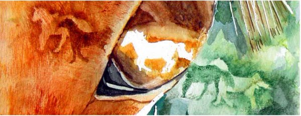


So this set of illustrations fits the topic in that I have certain worries about them. One is how well they relate to each other. (One is traditional media one is digital. Can you tell which is which?) I'm doing the digital because while I love the look (and even the process) of the ink resist it is time consuming, messy (India ink and kids can be volatile mixture...) and sends a lot of paint down the drain. So the computer is still time consuming (and has its own set of environmental impacts) but saves the carpets and drains--and can be walked away from at a moments notice for the myriad of small crisises that need immediate handling.
I had a portfolio review a few weeks ago and one of the things she thought I needed were a few sets of images, (two were good so that I could put one on each side of a postcard for mailers), that showed a story progression. So I'm trying to work on that. One of the things that has been great about Illustration Friday for me is that it has kept me working and given me a few more portfolio pieces. But since I eventually want to illustrate picture books--I need more things that show a story rather than a vignette.
9 comments:
Ah, I really loved your story about the volatile-explosive mixture of kids and ink!!I think your illos are great:this 2 guys are really fighting Is a real drama here:)))!I don´t have a trained eye,but I would guess,the one above(I mean the duel one,inside the house)have some electronic ink added,because this blue is really very blue:)),the walls also seem to be ''round-brushed'':is really nice made!!By the way nice chromatic this touch of blue,the same with the black parts of birds!And by the way, (again),I must say I appreciated very much your comment!Thanks a lot and best of wishes!!
I like your 2 illos with the feisty black birds.
I would not have known they were done in different mediums. You got the colors matching and I am assuming the top one is digital.
Best of luck in your endeavors, Lisa
Thanks for sharing your insight. I love the color and look of both pieces. The top one seems a tad bit richer in color to me. Just beautiful.
I, too, need more pieces in my portfolio that show progression as you mentioned. Thanks again for sharing so much. :)
teri
These tell a marvelous and exciting story! I, too, would never have guessed that one was digital. Both are so very nicely colored. Perhaps the top illo is digital (the colors look a little more saturated)? Your style is wonderful.
I love the look of your resists. Digital or not doesn't seem to matter since they both have the "look." Thank you for visiting my site and your kind words.
Both are very striking images and would make for wonderful portfolio pieces. I prefer the bottom one (if I must choose) because the lines are cleaner and more defined and it looks original to me. (hand done)I prefer good old fashioned mediums over digital, but I can very much appreciate ones with digital skills :)
I invite you to visit my blog.
www.ruisousaartworks.blogspot.com
Thank you very much
Thanks for visiting my blog. Beautiful paintings. I think the top pic is a digital image..both are equally gorgeous though!
They're brilliant, love your colour palette , and I wouldn't have known that either of them was digital, in fact if I was to chose I'd have said the bottom one was the digital but I see that everybody else says the top one so what do I know except that i think they're very expressive and do tell a story, so no worries right:)
PS they remind me of my magpies.
Post a Comment